Filter components allow you to add your own filter types to AG Grid. Use them when the Provided Filters do not meet your requirements.
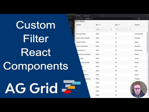
The example below shows a custom filter on the Athlete column with "fuzzy" matching.
Implementing a Filter Component Copy Link
To configure custom filters, first enable the grid option enableFilterHandlers.
If you do not enable the grid option enableFilterHandlers, it is still possible to use custom filters, however this will involve embedding your filter logic into the custom component, and is not recommended. See Legacy Filter Component.
Implementing a custom filter requires two parts:
- The custom filter component which will be displayed to the user.
- The the logic to run the filter.
Custom filter components are controlled components, which receive a filter model as part of the props, and pass model updates back to the grid via the onModelChange callback.
A filter model of null means that no filter is applied (the filter displays as inactive). Note that the filter is applied immediately when onModelChange is called. This behaviour can be changed by Using Buttons.
export default ({ model, onModelChange, getValue }) => {
    return (
        <div>
            <input
                type="text"
                value={model || ''}
                onChange={({ target: { value }}) => onModelChange(value === '' ? null : value)}
            />
        </div>
    );
}
Custom Filter Parameters Copy Link
Filter Props Copy Link
The following props are passed to the custom filter components (CustomFilterDisplayProps interface). If custom props are provided via the colDef.filterParams property, these will be additionally added to the props object, overriding items of the same name if a name clash exists.
The current applied filter model for the component. |
The current state to display in the component. |
Callback that should be called every time the model in the component changes.
additionalEventAttributes If provided, will be passed to the filter changed event
|
If using the filter with apply buttons, callback that should be called every time the unapplied model in the component changes. |
Can be called to manually apply any of the filter actions that would be done via buttons.
additionalEventAttributes If provided, will be passed to the filter changed event
event If the action was via the keyboard, provide the event here for correct focus handling.
|
Callback that can be optionally called every time the filter UI changes. The grid will respond with emitting a FilterUiChangedEvent. Apart from emitting the event, the grid takes no further action. The callback takes one optional parameter which, if included, will get merged to the FilterUiChangedEvent object.
|
Get the filter handler instance. If using a SimpleColumnFilter, the handler is is a wrapper object containing the provided doesFilterPass callback.
|
FilterDisplaySource |
The column this filter is for. |
The column definition for the column. |
Get the cell value for the given row node and column, which can be the column ID, definition, or Column object. If no column is provided, the column this filter is on will be used.
|
A function callback, call with a node to be told whether the node passes all filters except the current filter. This is useful if you want to only present to the user values that this filter can filter given the status of the other filters. The set filter uses this to remove from the list, items that are no longer available due to the state of other filters (like Excel type filtering).
|
The grid api. |
Application context as set on gridOptions.context. |
Filter Callbacks Copy Link
The following callbacks can be passed to the useGridFilterDisplay hook (CustomFilterDisplayCallbacks interface). All the callbacks are optional. The hook only needs to be used if callbacks are provided.
Optional: A hook to perform any necessary operation just after the GUI for this component has been rendered on the screen. If a parent popup is closed and reopened (e.g. for filters), this method is called each time the component is shown. This is useful for any logic that requires attachment before executing, such as putting focus on a particular DOM element.
|
Optional: A hook to perform any necessary operation just after the GUI for this component has been removed from the screen. If a parent popup is opened and closed (e.g. for filters), this method is called each time the component is hidden. This is useful for any logic to reset the UI state back to the model before the component is reopened.
|
Optional: Gets called when new rows are inserted into the grid. If the filter needs to change its state after rows are loaded, it can do it here. For example the set filters uses this to update the list of available values to select from (e.g. 'Ireland', 'UK' etc for Country filter). To get the list of available values from within this method from the Client Side Row Model, use gridApi.forEachLeafNode(callback).
|
Optional: Called whenever any filter is changed. |
Filter Logic Copy Link
The logic to run the filter can be provided in one of two ways:
- As a
doesFilterPasscallback for simple filter cases. - As a filter handler object for more complex filter cases.
The logic is passed via the filter property along with the custom component as a ColumnFilter object.
Filter component to use for this column. agNumberColumnFilter, agTextColumnFilter, agDateColumnFilter, agMultiColumnFilter, agSetColumnFilter. FilterDisplay |
Contains the logic for executing the filter. If the filter is active, will be called for each row in the grid to see if it passes. If any filter fails, then the row will be excluded from the final set. Not required if providing a handler, or if not using Client-Side Row Model.
|
Returns a handler which contains the logic for executing the filter. Allows for more complex filter cases than doesFilterPass. Not required if providing doesFilterPass (but will take precedence), or if not using Client-Side Row Model.
|
The filter logic is only used with the Client-Side Row Model. If being used exclusively with other row models, it does not need to be provided as the filtering logic is performed on the server. If a handler is provided, it will still be instantiated, but doesFilterPass will not be called.
doesFilterPass Callback Copy Link
const [columnDefs, setColumnDefs] = useState([
    {
        field: 'year',
        filter: {
            component: YearFilter, // custom filter component
            doesFilterPass: (params) => {
                // evaluate filter for row here
                return model === params.handlerParams.getValue(params.node);
            },
        },
    }
]);

<AgGridReact columnDefs={columnDefs} />
The callback doesFilterPass(params) will be called for each row when filtering is performed (and the filter is active), and takes the following as a parameter:
TModel |
FilterHandlerBaseParams |
The row node in question. |
The data part of the row node in question. |
Filter Handler Copy Link
const [columnDefs, setColumnDefs] = useState([
    {
        field: 'year',
        filter: {
            component: YearFilter, // custom filter component
            handler: (params) => ({
                doesFilterPass: (params) => {
                    // evaluate filter for row here
                    return passes;
                },
                // other handler methods
            }),
        },
    }
]);

<AgGridReact columnDefs={columnDefs} />
The filter handler function should return a FilterHandler which will be created when the filter is active. The doesFilterPass method on the evaluator will be called for each row when filtering is performed (and the filter is active).
The filter handler is useful for when the filter model needs parsing to allow for fast comparison of values. The handler is passed the latest filter model via the init / refresh methods, which can then process the model before doesFilterPass is called.
Optional: Called once when the handler is created. |
Optional: Called every time the handler is updated, e.g. when the model changes. |
The grid will ask each active filter, in turn, whether each row in the grid passes. If any filter fails, then the row will be excluded from the final set.
|
Optional: Used by AG Grid when rendering floating filters and there isn't a floating filter associated for this filter, this will happen if you create a custom filter and NOT a custom floating filter.
|
Optional: Gets called once by grid when the component is being removed; if your component needs to do any cleanup, do it here |
Optional: Gets called when new rows are inserted into the grid. If the filter needs to change its state after rows are loaded, it can do it here. For example the set filters uses this to update the list of available values to select from (e.g. 'Ireland', 'UK' etc for Country filter). To get the list of available values from within this method from the Client Side Row Model, use gridApi.forEachLeafNode(callback).
|
Optional: Called whenever any filter is changed. |
Using Buttons Copy Link
It is possible to use the Filter Buttons for grid-provided filters with custom filter components.
The example above demonstrates using filters with buttons via the same custom filter component:
- The Year Default column does not use buttons.
- The Year Apply column uses the apply button, and additionally closes the filter popup on apply.
- The Year Reset column uses the reset button, which will set the filter back to the default model and apply it.
The buttons are configured by passing additional parameters to the filter (interface FilterWrapperParams).
Specifies the buttons to be shown in the filter, in the order they should be displayed in. The options are: 'apply': If the Apply button is present, the filter is only applied after the user hits the Apply button. 'clear': The Clear button will clear the (form) details of the filter without removing any active filters on the column. 'reset': The Reset button will clear the details of the filter and any active filters on that column. 'cancel': The Cancel button will discard any changes that have been made to the filter in the UI, restoring the applied model. |
If the Apply button is present, the filter popup will be closed immediately when the Apply or Reset button is clicked if this is set to true. |
When the buttons are pressed, the custom filter state parameter will be updated via the refresh(params) method, with state.model being the model that should be displayed in the filter.
With the Apply button present, the filter component no longer needs to call onModelChange as the grid will apply the model when the button is clicked (although it can still be called if the component wants to apply a model in some other way). Instead, the filter component will call onStateChange with the model that is currently displayed in the filter component. This is the model that the grid will apply when the button is clicked. If the filter is being used without buttons, it can also call onAction('apply') to apply the model set via the state.
Associating Floating Filter Copy Link
If you create your own filter you have two options to get floating filters working for that filter:
- You can create your own Custom Floating Filter.
- You can implement the
getModelAsString()method on your filter evaluator. If you implement this method and don't provide a custom floating filter, AG Grid will automatically provide a read-only version of a floating filter. See Custom Filter And Read-Only Floating Filter.
If you don't provide either of these two options for your custom filter, the display area for the floating filter will be empty.
Custom Filters Containing a Popup Element Copy Link
Sometimes you will need to create custom components for your filters that also contain popup elements. This is the case for Date Filter as it pops up a Date Picker. If the library you use anchors the popup element outside of the parent filter, then when you click on it the grid will think you clicked outside of the filter and hence close the column menu.
There are two ways you can get fix this problem:
- Add a mouse click listener to your floating element and set it to
preventDefault(). This way, the click event will not bubble up to the grid. This is the best solution, but you can only do this if you are writing the component yourself. - Add the
ag-custom-component-popupCSS class to your floating element. An example of this usage can be found here: Custom Date Component
Accessing the Component Instance Copy Link
AG Grid allows you to get a reference to the filter component instances via api.getColumnFilterInstance(colKey). This returns a wrapper component that matches the provided grid filter components that implement FilterDisplay. To get the React custom filter component, the helper function getInstance can be used with this. As React components are created asynchronously, it is necessary to use a callback for both methods.
Similarly, you can get a reference to the filter evaluator via api.getColumnFilterEvaluator(colKey).
// let's assume a React component as follows
export default forwardRef((props, ref) => {
    useImperativeHandle(ref, () => {
        return {
            ... // required filter methods

            // put a custom method on the filter
            myMethod() {
                // does something
            }
        }
    });

    ... // rest of component
}

// later in your app, if you want to execute myMethod()...
laterOnInYourApplicationSomewhere() {
    // get reference to the AG Grid Filter component on name column
    api.getColumnFilterInstance('name').then(filterInstance => {
        getInstance(filterInstance, comp => if (comp != null) {
            comp.myMethod();
        });
    });
}
The example below illustrates how a custom filter component can be accessed and methods on it invoked. If you click on the Invoke Filter Instance Method button, it will invoke the instance componentMethod, which logs to the developer console.
Next Up Copy Link
Continue to the next section to learn about Floating Filters.